The Real Reason Trial Users Never Convert
Trial conversion problems are often blamed on price or traffic. The deeper issue is usually unclear value, onboarding friction, and lost momentum.
Trial users rarely fail to convert because they carefully evaluated your product and rejected it.
More often, they never get that far.
They sign up with some intent. They want the outcome you promised. They click through a few screens, hit a confusing setup step, lose the thread, and tell themselves they will come back later.
Then the trial ends.
On your side, it looks like a conversion problem. Maybe pricing. Maybe traffic quality. Maybe the trial length. Maybe missing features.
On the user’s side, it often felt less decisive:
“I was not sure what to do next.”
“I could not tell if this was worth setting up.”
“I needed to see value before inviting anyone.”
“I opened it, but I did not know how to evaluate it.”
Trial conversion is not only about persuading users to pay. It is about helping them become confident enough to keep evaluating.
A Trial User Is Not A Customer Yet
This sounds obvious, but many products forget it.
A customer has already decided the product matters. They may tolerate complexity because the value is known. They may read docs, configure settings, invite teammates, or wait for data because they understand the payoff.
A trial user is still asking whether the product deserves that effort.
Every screen is evidence. Every setup step is a trust request. Every empty state, feature label, and dashboard card either increases confidence or adds doubt.
That is why trial onboarding needs a different bar than customer onboarding. It is not enough to expose the product. The experience has to help the user evaluate it.
The question is not, “Can users access everything?”
The question is, “Can users reach a believable moment of value before their attention expires?”
The Usual Suspects Are Too Convenient
When trial-to-paid conversion is weak, teams often blame the visible things.
Pricing is visible. Traffic source is visible. Competitors are visible. Feature requests are visible.
Confusion is harder to see.
So the team lowers price, adds a discount, extends the trial, builds another feature, or changes the acquisition channel. Those moves can help when the diagnosis is right. But if the real issue is unclear value, they mostly add motion.
A cheaper product is not easier to understand.
A longer trial does not fix a weak first session.
More features can make evaluation harder.
Better traffic still churns if the product asks for commitment before clarity.
Before changing the offer, inspect the experience. Did users reach activation? Did they understand the first useful outcome? Did they know which step mattered most? Did setup feel safe, bounded, and worth it?
If not, the conversion problem may be a confidence problem.
Time-To-Value Is Really Time-To-Belief
SaaS teams talk about time-to-value as if value is a task completion event.
The user connected an integration. The user created a project. The user imported contacts. The user ran a report.
Those events matter. But users do not convert because they completed an event. They convert because the event helped them believe something:
“This solves the problem I came with.”
“This will save me time.”
“This is easier than my current workaround.”
“I can explain this to my team.”
“I trust this enough to use real data.”
That is time-to-belief.
A product can be fast and still fail if the first session does not create belief. A user can complete setup in three minutes and still wonder why the product matters. Another product can take longer to configure but convert better because each step makes the payoff clearer.
The goal is not simply to shorten onboarding. The goal is to remove uncertainty before it becomes abandonment.
Overwhelming Dashboards Make Users Feel Behind
Founders love showing capability. That instinct makes sense. You built a lot, and you want the product to look valuable.
But a powerful dashboard can be a rough first impression.
A new user lands inside the app and sees reports, segments, workflows, automations, alerts, templates, integrations, and settings. The interface may be clean. The product may be genuinely useful.
The user still has to answer too many questions:
Where do I start?
Which part matters for my use case?
What can I ignore?
How much setup is hiding behind this?
What does “good” look like here?
The dashboard was meant to signal capability. Instead, it signals homework.
Trial users do not need the whole product map on day one. They need the shortest credible path to a useful conclusion.
Setup Friction Is Often Emotional
Teams often measure setup friction by effort: how many steps, how many fields, how many minutes.
Users also measure it by risk.
Connecting a CRM may be one click, but it can feel heavy if the user does not know what data will be imported. Inviting a teammate may take five seconds, but it can feel risky if the product does not explain what happens next. Installing a script may be straightforward, but it can feel expensive if the user is not sure the product will be worth engineering time.
This is why some “simple” onboarding steps still create drop-off.
The user is not only asking, “Can I do this?”
They are asking, “Do I trust this enough to do it now?”
Strong trial onboarding answers that question before asking for commitment. It shows examples before setup. It explains permissions before invites. It clarifies effort before configuration. It lets users understand the destination before they start walking.
Feature Overload Hides The Value
More product surface can make a trial feel less persuasive.
Every feature asks the user to build a mental model. Every tab competes with the action that would actually move them toward activation. Every advanced option increases the chance that the user feels like they are evaluating the wrong thing.
This is especially dangerous for products serving multiple use cases.
A founder trying to reduce churn does not need a generic tour of everything. A product manager trying to improve activation does not need every reporting option immediately. A growth lead evaluating trial conversion wants to know how the product helps them make a better decision soon.
If the trial experience tries to serve everyone at once, each user has to find their own path to value.
Many will not.
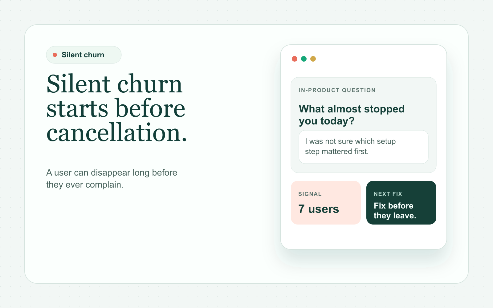
Non-Conversion Is Often Unresolved Evaluation
A user who does not upgrade may not have rejected the product. They may simply have failed to reach a clear conclusion.
That distinction changes the fix.
Rejection means the user understood the product and decided it was not worth paying for.
Unresolved evaluation means the product never helped them become sure enough.
Look for the second pattern:
- Users sign up but do not take the first meaningful action
- Users open setup docs but do not install
- Users visit several pages in one session and never return
- Users reach pricing before activation
- Users invite no teammates despite team-based value
- Users open a feature once and never revisit it
These are not proof of confusion, but they are strong places to investigate. They show where attention existed before momentum disappeared.
What To Fix Before You Touch Pricing
Before discounting, extending the trial, or adding another feature, tighten the evaluation path.
Make The First Useful Action Obvious
The first screen should answer: “What should I do now to know if this is for me?”
Not every possible action. Not the whole product. One useful next step.
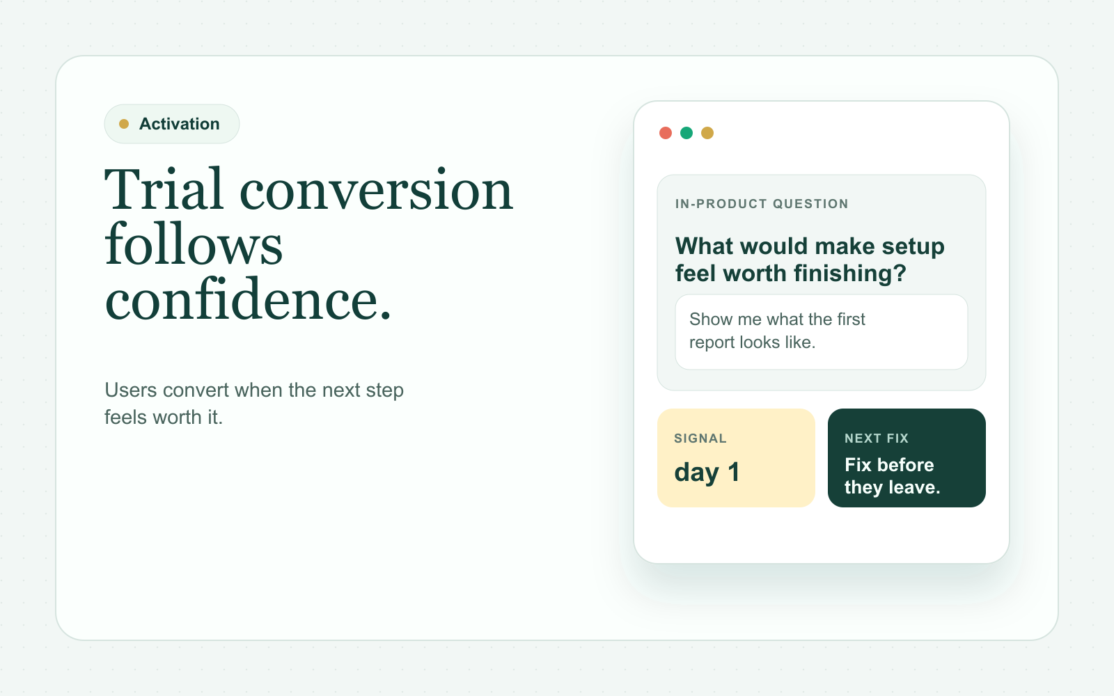
Show The Destination Early
If the product needs data, show a sample state. If it produces reports, show an example report. If it requires an integration, show what happens after connection.
Users are more willing to do setup when they can see the payoff.
Explain Effort And Risk Clearly
Say whether setup takes two minutes or requires an engineer. Say what happens when teammates are invited. Say what data is accessed. Say whether the action is reversible.
Unclear effort feels larger than honest effort.
Delay Advanced Surface Area
Do not make new users sort through every feature before they understand the core value. Hide secondary workflows. Defer advanced settings. Keep the first session focused.
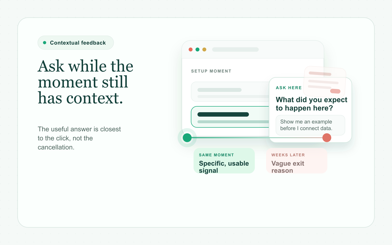
Ask While The Trial Is Alive
Do not wait until the trial expires to ask why users did not convert. Ask during the moments where evaluation gets stuck.
Useful questions include:
- What were you hoping this screen would help you understand?
- What feels unclear about the next step?
- What would make setup feel safe enough to finish?
- What did you expect to see after signing up?
- What would you need to believe before inviting your team?
- What almost stopped you from continuing today?
The answers will help you separate bad fit from unclear value.
Conclusion: Conversion Follows Confidence
Trial users convert when the product helps them understand value, trust the next step, and build momentum before their attention moves elsewhere.
If your trial conversion is weak, do not start by assuming the price is wrong or the product needs more features. Look first at confusion, unclear value, onboarding friction, slow time-to-belief, and unresolved uncertainty.
Those problems are often fixable. Better yet, they are usually visible if you ask close enough to the moment where users lose momentum.
ChimeIn is being built for SaaS teams that want to catch those moments earlier. If you want a better way to understand where users lose confidence before they disappear, join the ChimeIn waitlist.